Cango Metal Ankiros 2024
Turkey / Istanbul
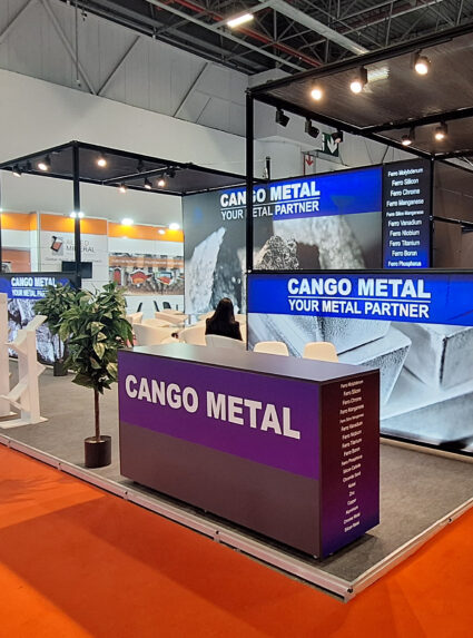
At Ankiros 2024, the maxima exhibition stand we designed for Cango Metal aimed to reflect the brand’s products and vision in the best possible way. On the 80m2 stand, we presented Cango Metal’s strong production capacity and innovative solutions to visitors in a clear and impressive way.
Erdemir Ankiros 2024
Turkey / Istanbul
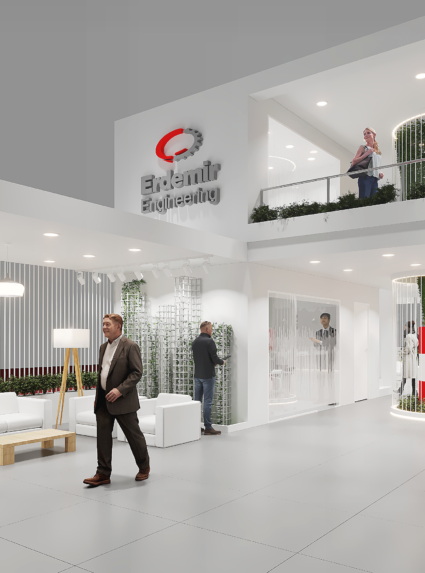
At Ankiros 2024, in this project, where Erdemir’s sustainability and innovation goals were explained, we aimed to tell the story and goals of a brand by using the power of architecture. At many points of our 210m2 stand, we embodied Erdemir’s vision for the future.
Erdemir MetalExpo 2024
Turkey / Istanbul
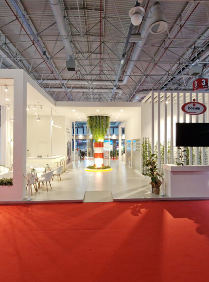
In this project, where Erdemir’s sustainability and innovation goals were explained at MetalExpo 2024, we aimed to tell the story and goals of a brand by using the power of architecture. At many points of our 180m2 stand, we embodied Erdemir’s vision for the future.
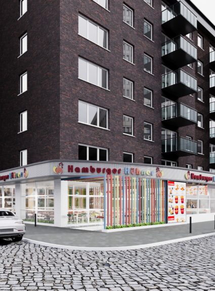
Hamburger Hühner Restaurant
Almanya / Hamburg
At the request of our customer, we designed a functional and lively chicken restaurant using pastel colors on an area of approximately 100m2.
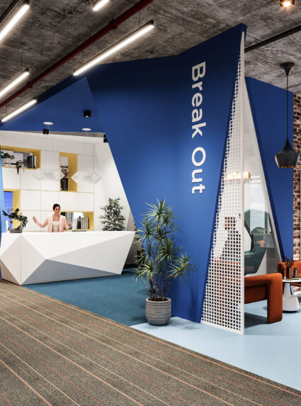
Omsk Carbon Piazza Office
İstanbul / Maltepe
Upon the needs of our customers, they had an open office system in which they would work in approximately 45 buildings and the head office design they used.
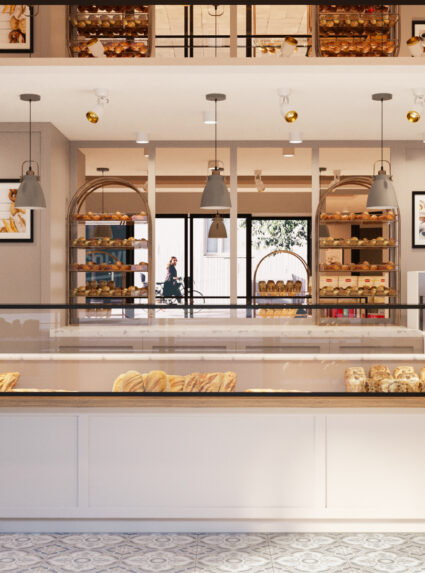
Bağlar Bakery
Türkiye / İstanbul
In line with our client’s purposes, we aimed to make the space feel spacious by using transparent surfaces and mirrors in the design. We increased the perception of depth by creating contrast between display units and glass joinery and light colored walls and furniture.
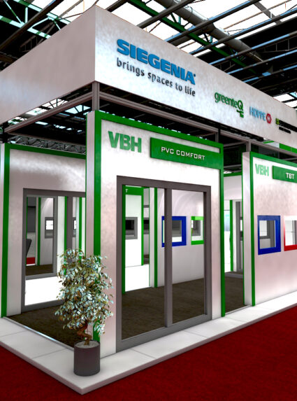
VBH Avrasya Pencere 2021
Türkiye / İstanbul
In this budget-oriented modular design of 126 m2 exhibition stand, different corridors have been created in order to provide various areas for the mounted door, window and different products of VBH.
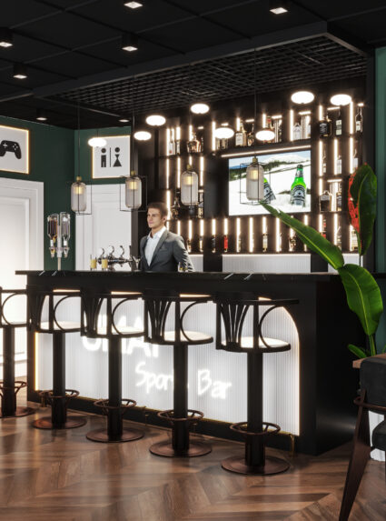
Umai Sports Bar
Almanya / Hamburg
At the request of our customer, we aimed to design a stylish and effective space with vibrant colors and good lighting. We created a retro atmosphere with aged mirrors and pastel color tones we used.
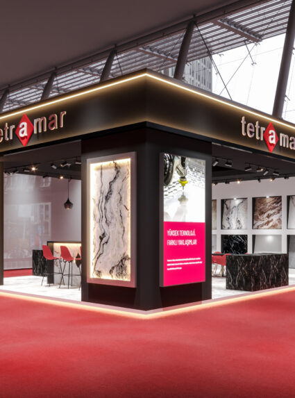
Tetramar Marble İzmir 2023
Turkey / İzmir
We aimed to imagine a stylish and functional fair stand where we can display our 122×122 cm products for our customer, who is a marble manufacturer.
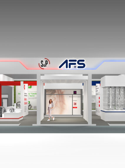
AFS S&P Sodex 2019
Turkey / İstanbul
Sodex 2019
In this stand, which we designed for the company where we produce the sanitary ware, we aimed to create a spatial image by turning to diversity with colors, apart from separating the different areas where they are presented with different functions with dividing walls.
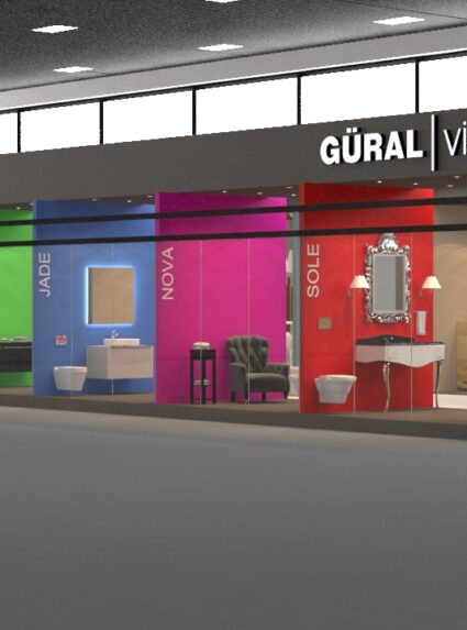
Güral Vit Cersai 2015
Turkey / İstanbul
In this stand, which we designed for the company where we produce the sanitary ware, we aimed to create a spatial image by turning to diversity with colors, apart from separating the different areas where they are presented with different functions with dividing walls.
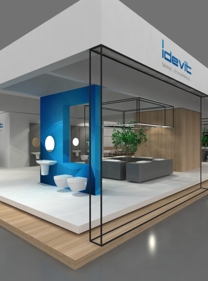
İdevit Unicera 2017
Turkey / İstanbul
In this stand, which we designed for a ceramic and sanitary ware company, we made the products representing the brand the focal point of the design by associating them with the brand’s signature color. We gave importance to compactness and simplicity in design.
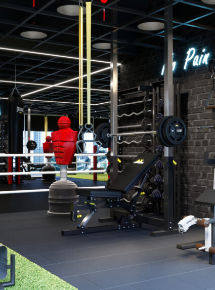
ST Gym
Turkey / İstanbul
Apart from modern gyms, we aimed to create movement and vitality as well as functionality. We achieved this liveliness by giving place to bold colors at some points in the space where dark colors are dominant. At the same time, we added dynamism to the space with curvilinear lightings in contrast to the rationality of the wall design.
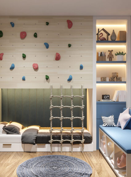
Acr House 02
Turkey / İstanbul
We have designed a functional space to meet the rest and study needs of children. We also made an alternative design with climbing tools for our expansion area client.
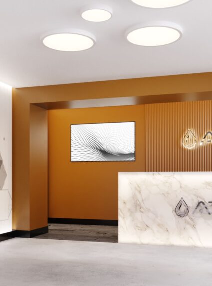
Atic Chemistry
Turkey / Kocaeli
We have been asked to design an entrance area for the ATIC CHEMICAL office building in Dilovası, Kocaeli. The colors that will highlight the institutionality of the brand, a marble information desk and a spacious waiting area are the main elements of the project.
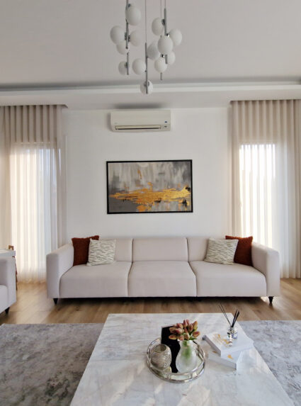
Peker House İnterior
Turkey / İzmit
The most important element in living room design; The space is spacious. These are; natural light is provided by light color and high ceiling elements. Using dark colors in some specific areas in the space saves the environment from mediocrity and provides originality.Color harmony is as important a design element as functionality in kitchens. In addition, blending all these with lighting elements increases the value of the space exponentially.
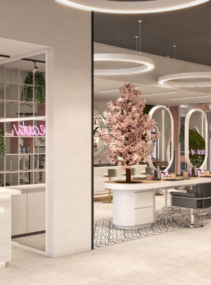
SRC Coiffeur Düsseldorf
Germany / Düsseldorf
In order to provide simplicity and spaciousness in the space, light pastel colors and amorphous lightings are used in many places. In order to add depth to the space, mirrors are included in the entire space, including the counter section. A perception of depth is created with the color selection made on the ceiling.
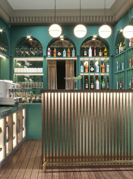
Umai Restaurant & Bar
Almanya / Hamburg
At the request of our customer, we aimed to design a stylish and effective space with vibrant colors and good lighting. We created a retro atmosphere with aged mirrors and the pastel color tones we used.

Sitz House Vienna
Germany / Vienna
Our aim in this house design located in a town in Austria was to fit the house into the traditional texture of the surrounding. In order to achieve this, rustic stone mesh and slate stone etc. We used traditional building materials such as.
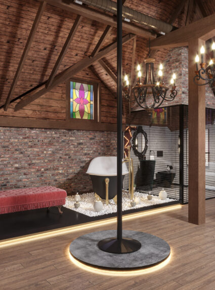
Nold Suit
Turkey / İstanbul
It has become a place where we blend classical and modern structures in line with the wishes of our customers who want to exhibit antique products. We aimed to create a historical venue with products such as brick and polished solid wood.
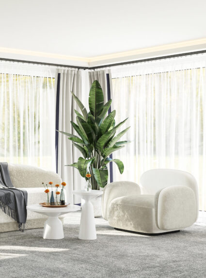
MC House
Germany / Hamburg
At the request of our customer, we designed a simple place in which cream color is used. Our aim was to create a quiet and comfortable sleeping environment as well as to make the place look modern.
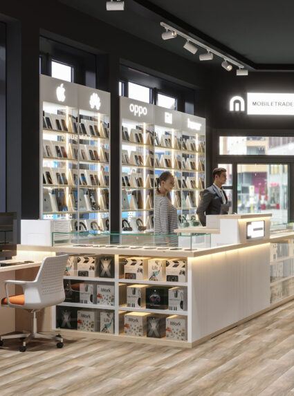
Mobile Trade Hamburg
Germany / Hamburg
We aimed to create a sincere and soft atmosphere in our store where electronic devices will be sold, to spend a long time without getting bored, to trade, to drink coffee and to watch TV.
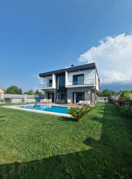
Peker House
Turkey / İzmit
In the design of Peker House, we aimed to create an intimate space as well as a modern look. In addition, we have created a functional and compact structure. Stone, wood and glass were used predominantly in the design. We have created a space where traditional and modern architecture are intertwined.
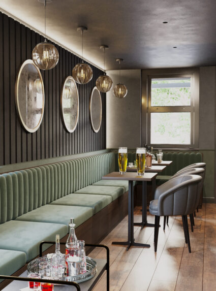
Bar 380
Germany / Hamburg
Integrity and operational harmony are very important, especially in outdoor design. Apart from this, revealing and adding commonly used building materials will yield successful results. The elements that we pay the most attention to in this design are; harmony with the environment and using local materials.
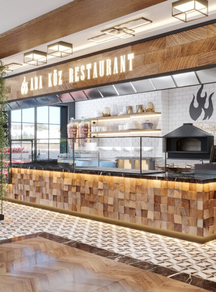
Adaköz Restaurant
Germany / Hamburg
We have planned to create more natural and intimate spaces by using plants and wallmoss in our designs. In addition, by using mirrors in narrow spaces, we made the space feel wider.We planned to add a more intimate atmosphere to the space with the ceramic tiles and parquet-like ceramics we used on the floor. Apart from that, we used pastel tones of green, pink and gray colors to animate the space.
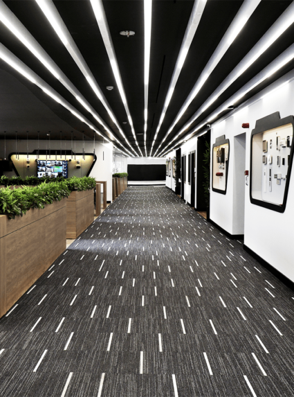
Okisan Office & Showroom
Turkey / İstanbul
The concept design of Okisan, a technology company that offers security products and services, was made to show the company’s technological vision. In the space, which welcomes its visitors with a marble information desk and technological panels telling the history of the company, mirrors that will create a feeling of infinity when you head to the showroom area and rhythmic asymmetrical linear areas that will make you feel the technological atmosphere have been created.
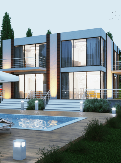
Novus House
Austria / Vienna
This house is designed for 3 membered family who lives outside of Vienna, in the middle of nature. The main purpose of design was to welcome the natural lighting and the forest inside the house . In order to make full use of the light introduced from the outside, glasses are used in the railings in the interlayer and partition which achieves the permeation of light and the penetration on visual sense.
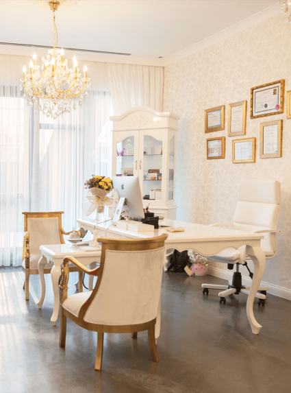
Luva Beauty Clinic
Turkey / İstanbul
Our main design object for this multifunctional clinic and beauty academy; was creating a holistic design approach yet appear like an art gallery.
In this space which offers service especially for women, we were inspired by the wealth of the woman spirit and reflected that into design with diversities.
Therefore modern art pictures have been placed into classic gold leafed frames; concrete looking epoxy flooring has been combined with the glamorous wallpapers or classic carved furnitures with modern seating areas, dark colored ceiling with white velvet curtains and lastly classic glass chandeliers with incandescent lighting bulbs.
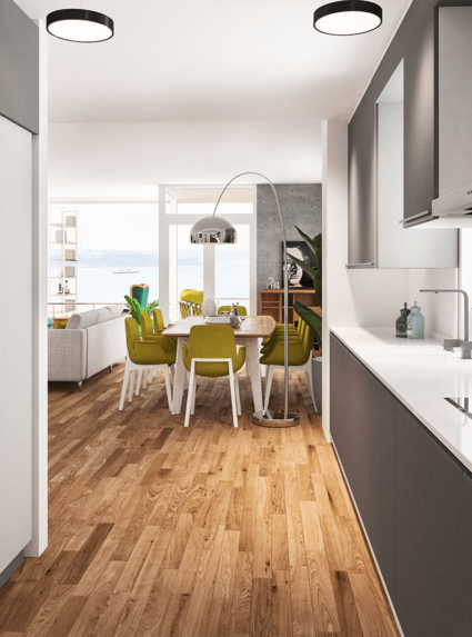
Osman Sınav House
Turkey / İstanbul
In this project, the main element that leads the design was the spectacular Istanbul siluet. Our goal was making the Istanbul view visible through the all living spaces in this two-story apartment.
With this respect, the kitchen is merged into the living room in the ground floor and designed as an open kitchen; also the bedroom and upper living room is cleared from the non-structural walls.
Additionally, a large window in the bathroom is created to make the view visible even when the homeowner rests in the bathtub. Natural looking materials are selected as a design concept in general.
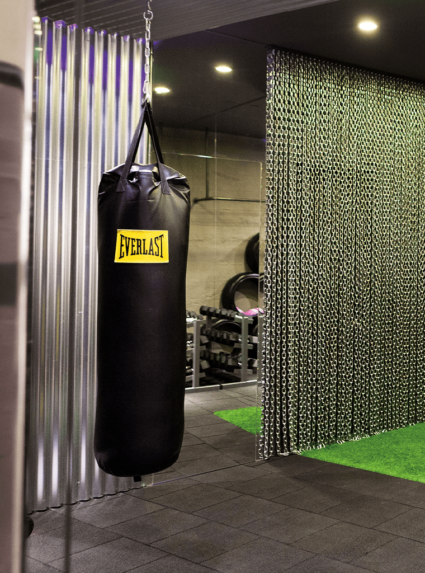
Exodus Gym Studio
Turkey / Istanbul
Our aim for this design was reflecting the spirit of this rough sport born in Thailand streets with the harmony of galvanised sheets, raw chains, concrete looking wall coverings, 18 inch wheels, black rubber flooring, artifical grass and bold dramatic colors.
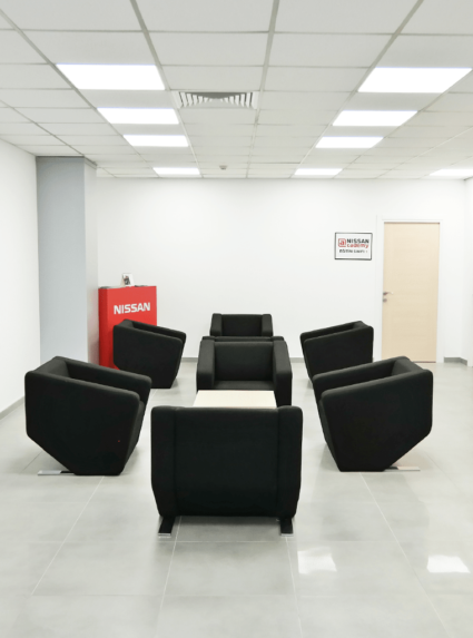
Nissan Head Office
Turkey / İstanbul
As an international automobile manufacturer, Nissan’s Turkey Head Office required some interior and exterior architectural services of us because of new space requirements. In this direction, many spaces, including the office, showroom, training and waiting areas, were redesigned and constructed by us.
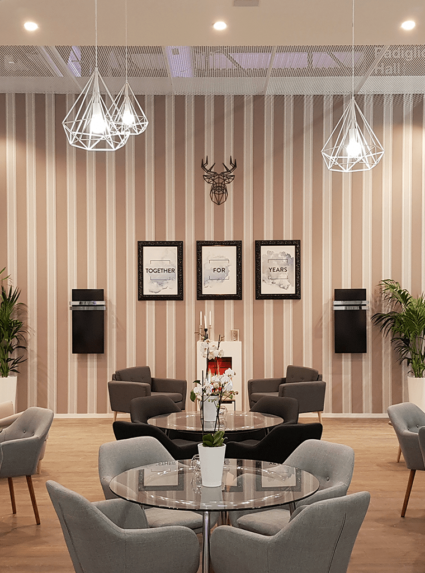
Eca Mostra Convegno Milan 2018
Italy / Milan
In this exhibition area for heating systems, our leading point is to reflect how ECA products bring coziness into the area. With this respect, the cafe is designed just as your living room with comfy sitting groups for 2-3 people, fireplace, decorative floors, lamps and wallpapers.
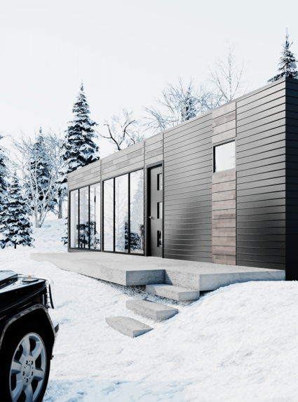
Container Hotel Reykjavik
Iceland / Reykjavik
We were asked to design modern hotel project by using containers in an Iceland village which gives opportunity to live the famous northern lights experience and the nature of Iceland. The containers are designed and planned to produced in Turkey, by Zoon Architecture. The units are planned to finish with all details in Turkey and then transport to Iceland via shipping.
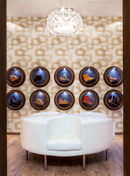
Stonefly Teşvikiye Store
Turkey / İstanbul
A decent district like Teşvikiye required a design that is as decent and exclusive as itself. With this object in mind, the marble facade is designed coherently with the historical context of the street, as well with the wrought iron signoard that is specially created for the Teşvikiye store.
A spacious and product oriented displaying strategy is applied by using special patterned wallpapers, bespoke shelves made in PVC pipes for displaying the hand-made shoes, rusted metal panels and solid wooden units.
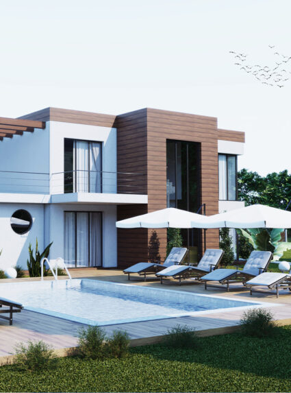
Twn House
Vienna / Austria
This twin houses are designed to respond the needs of two close famillies who have similar living styles. The garden and the pool area was designed as social spaces to bring together all family members. In order to make full use of the light introduced from the outside, glasses are used in the railings in the interlayer and partition which achieves the permeation of light and the penetration on visual sense.
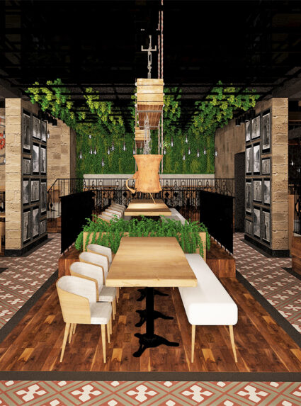
Telkari Restaurant
Turkey / Istanbul
Fort his Project we aimed to create traditional and welcoming environment by using wood, metal and plants. The food concept was coming from a city in Turkey called Mardin which is very well known with its traditional food.
Amir Kabir Plasteurasia 2016
Istanbul / Turkey
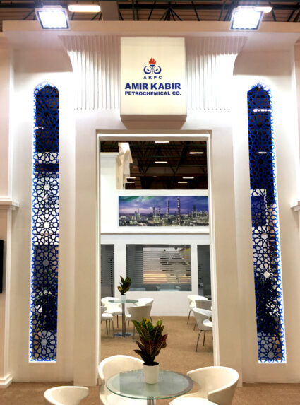
Completely design of this 150 m2 stand is belong to our partner firm in Dubai. As an İranian personatity of the customer firm. classical Persian style patterns, cnc cuts and all details are manufactured with high quality by us.
Tabriz Petrochemical Co. Plasteurasia 2017
Istanbul / Turkey
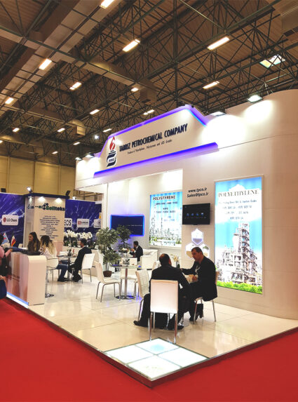
Curved corners and mix sized light boxes are the main components of this 70 m2 stand. Designed by our Dubai based partner firm and constructed by us.

JPC Petrochemical Co. Plasteurasia 2017
Istanbul / Turkey
JPC is one of the biggest firms of petrochemical industry and complete design of this stand is belong to our partner firm in Dubai. Co-operation of this project is finalized with customers satisfaction.
ARPC Shazand Petrochemical Co Plasteurasia 2017
Istanbul / Turkey
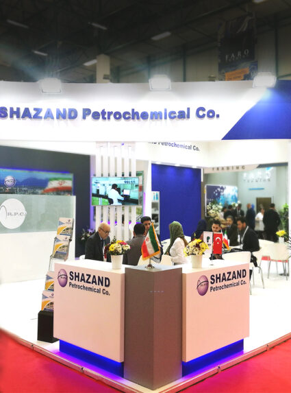
Curved girders and big sized light boxes are the main components of this stand. Blue and white colours of the stand are based on the logo of the firm. Designed by our Dubai based partner firm and constructed by us.
Demsa Shoes Corner
Istanbul/Turkey
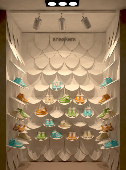
We have been asked to design a corner display unit for the Demsa Shoes brand. We made 2 different design proposals in an area of 10m2. Leaf panels to be produced from decorative sheet will give a stylish and modern look to the display unit of the shoes.
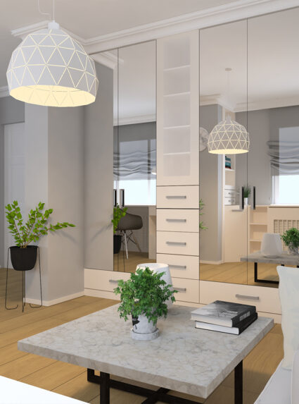
Erdoğan Şehit House
Istanbul/Turkey
In line with the request of our customer, the design of the kitchen, living room and bedroom was made by us. While the dominant color in all rooms is white, the other main material is wood. With the harmony of white and wood, spaciousness is provided in the design of the kitchen, living room and bedroom.
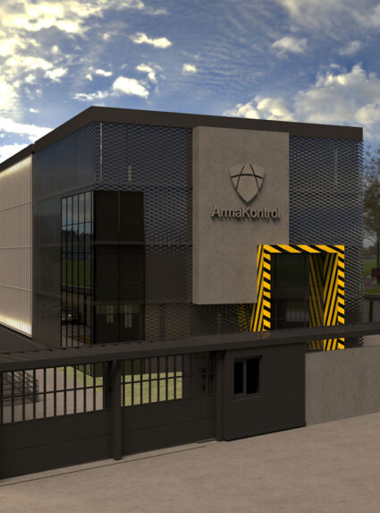
Arma Kontrol
Istanbul/Turkey
We have been asked to design a central office building for Arma Kontrol, the best barrier-safety products company. Anthracite tones and exposed concrete texture are used in all spaces in the design, which takes the main products of the company as a theme.
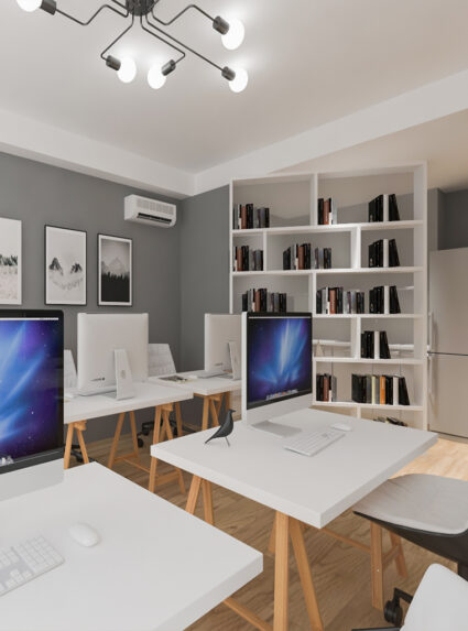
Rakun Dijital
Istanbul/Turkey
In this office design, the kitchen area, work area and a meeting room are included in the design. Systems have been proposed to separate the kitchen from the work area. Wood and soft tones were used together throughout the space.
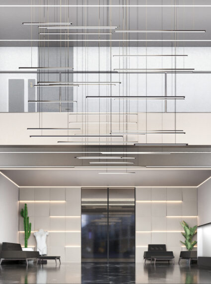
Edirne Work Center Lobby
Edirne/Turkey
We have been asked to renovate the lobby of a business center in Edirne. A remarkable and spacious entrance area was designed with the marble texture used on the floor, soft tones used on the walls and elegant lighting systems.
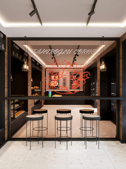
Tahiroğlu Bakery
Istanbul/Turkey
In this project designed for Tahiroğlu Fırın, mainly black tones and wood panel were used together. The aim is to show the modern face of the bakery store with simple materials.
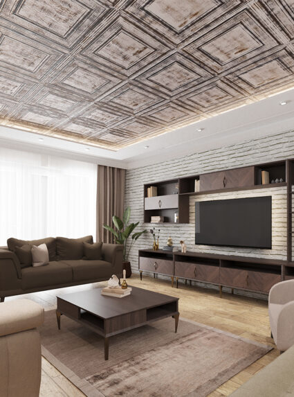
Serkan Kars House
Istanbul/Turkey
Our customer asked us to renovate their living room, kitchen and hall with their existing furniture. In addition to the existing furniture, new furniture has been proposed, predominantly wooden tones.
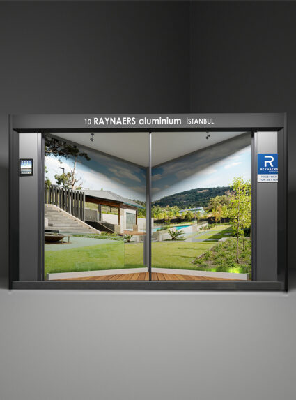
Reynaers Architect@Work 2018
Istanbul/Turkey
Reynaers Aluminium is a leading European specialist in the development and marketing of innovative and sustainable aluminium solutions for windows, doors, sliding systems, sun screening and conservatories. An exhibition stand has been designed for Reynaers Aluminum to be displayed at the fair.
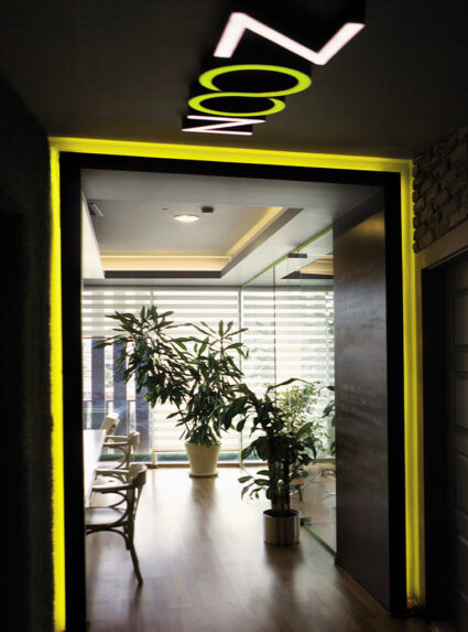
Zoon Architecture
Istanbul/Turkey
In this architectural office, mainly glass and mirrors are used to create a deeper perception. The colors and custom made functional furnitures are selected conveniently for reflecting the corporate identity of the firm. The kitchen is separated from the office with 300-liters-aqurium which provides a transparency. Recycled bricks and artificial grass carpets were the other design elements.
Joule ICCI 2015
Istanbul/Turkey
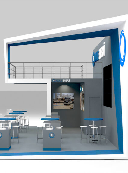
The stand was designed for Joule Energy who provides complete energy solutions. The structure has one mezzanine floor which is used for meetings. The aim was to answer client’s needs while emphasising brand’s main colors in overall stand.
Bridge Complex Project
Vienna / Austria
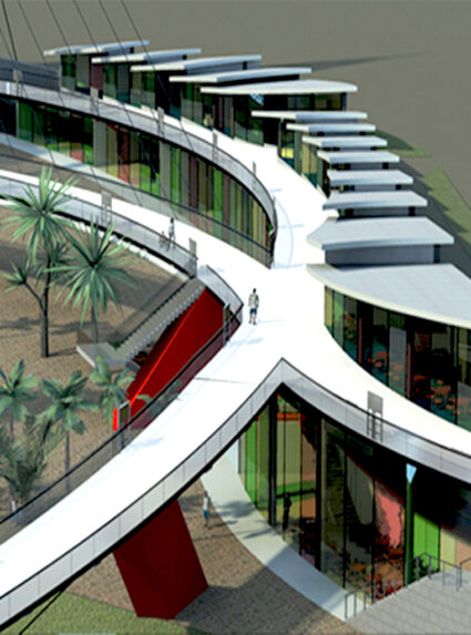
This was a multiple functioned pedestrian bridge which is designed for connecting the zone 1, zone 2, zone 3 in Wien with the digital signages that is located according to the site slope; sale and art education areas, relaxing and entertainment zones, the project became a centre of attraction.
Mobile House Concept Design
Austria / Spain / Italy
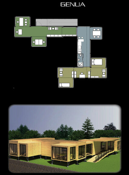
These three mobile containers are specially designed with multiple functions, to be used as house or office. At the end, they became an office of a Viennese artist for September to June and they have been carried by a lorry to Genova and Barcelona to be used as a summer house.
Stonefly Aymod 2013
Istanbul/Turkey
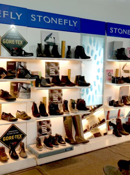
For this small fair stand we have aimed to reflect the Italian simple yet chic style.
Wrangler Aymod 2013
Istanbul/Turkey
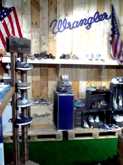
“Wrangler footwear offers a wide range of styles; whether it is warm leather boots in winter or colourful canvas shoes in summer, Wrangler has something to suit you” was the brand’s motto and our design origin as well. The distressed wood displaying units are used to remind the durability of the products, the facade wall is covered with the rusted metal sheets, the ceiling is constructed with the solid wood beams and the floor is covered with the artificial grass to create an outdoor feeling.
Cotecna Maden 2018
Istanbul/Turkey
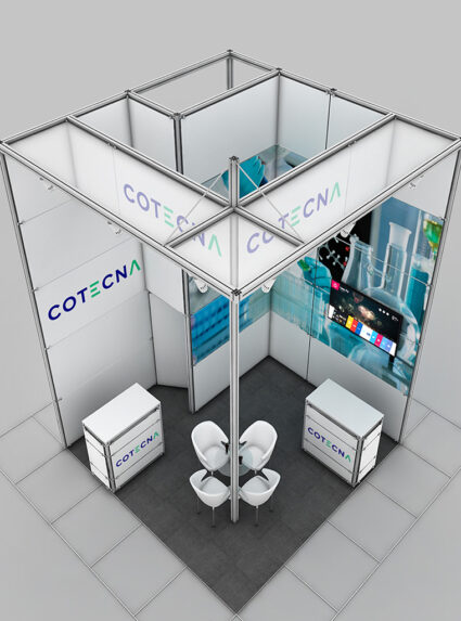
We are asked to construct an exhibition stand for Cotecna, leading provider of testing, inspection and certification services The stand is made through modular elements which makes easier to install the stand .
Empire Jewelry
Istanbul/Turkey
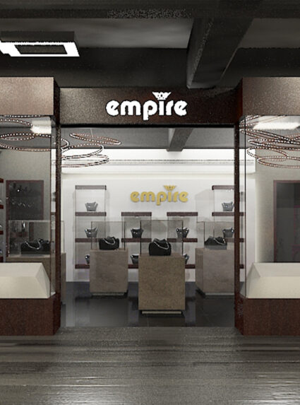
For this project, a luxurious and attractive concept has been created for the showroom of the local jewelery brand located in a district of Istanbul. A design that will highlight shining jewels has been preferred.
Çağrı Jewelry
Tekirdag/Turkey
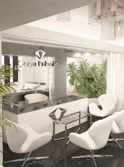
For this project we created a luxurious and appealing concept for a local jewelry brand showroom located in a close town to İstanbul. We used black and white as the main colors which will highlight the shiny jewelries.
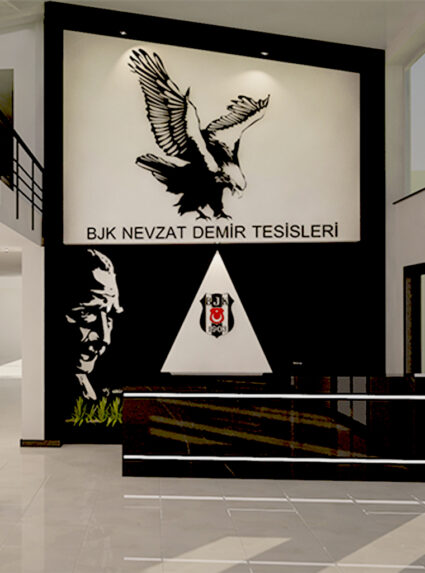
BJK Nevzat Demir Social Complex
Istanbul/Turkey
What required for Nevzat Demir Social Complex is the players to be accommodated in comfy rooms and visitors to feel the glorious history of Beşiktaş in the lobby. Therefore black and white colors are used in the lobby and soft colors in the player’s rooms.
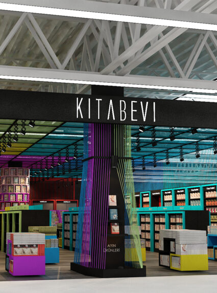
Carrefoursa Bookstore
Istanbul/Turkey
This design is created for the renovation of the stationery departments in CarrefourSA stores. What our client desire is to execute a design that overcomes the prejudice like CarrefourSA sells promotion boks only. In fact, they sell the latest published books as well.
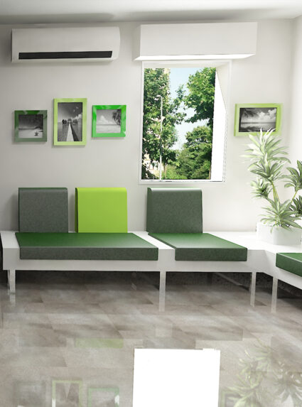
Eks Dental Clinic
Istanbul/Turkey
Dental clinics are usually distressing places for everyone. That leads us to create a space that eases the patients psychologically, by using custom printed pvc floors and different natural view printed wallpapers in each consulting room.

A.G. House
Istanbul/Turkey
For our customer who got bored of his/her 30-yeared outdated home, we created a lively, modern and elegant design that has a beautiful sea view.
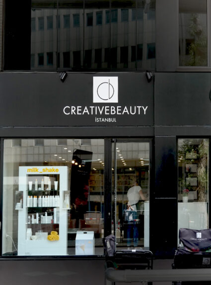
Creative Beauty
Istanbul/Turkey
Our client Creative Beauty is a hairdresser salon which is located in the central of İstanbul. Since the customers may spend a lot of time It was important to create a place of peace and tranquil. We achieved that with soft gray walls, white furnitures with a touch of pinky shade.
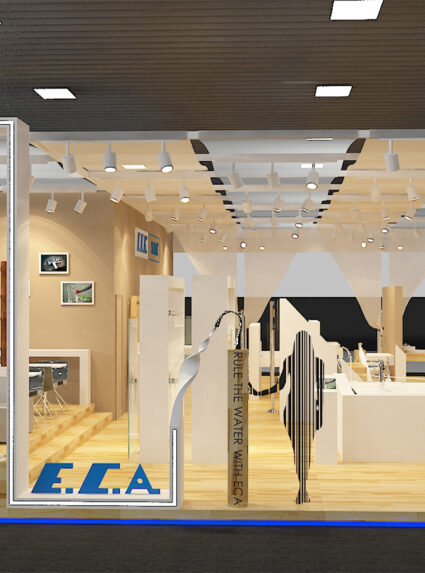
Eca Serel Cersai 2014
Bologna/Italy
Pure white illuminated corian and natural wooden materials are used as walls and displayers for the products. Light-weighted and permable nets are used on ceilings.
‘Rule the water with ECA’ was the motto of the brand and the design of the stand is inspired by the flowing of water.
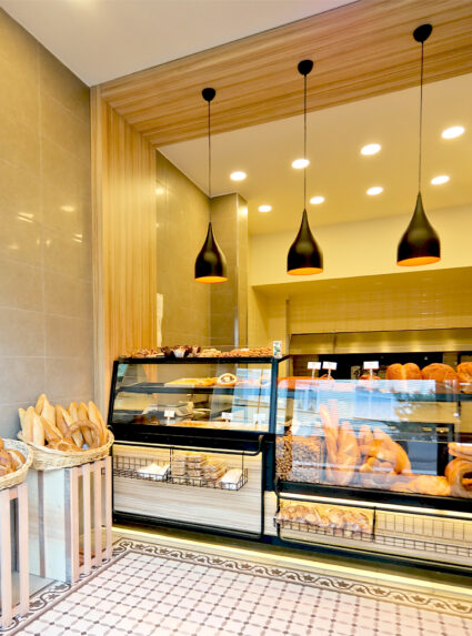
Güney Bakery
Istanbul/Turkey
The design aim of the Sarıyer based this project, is to show modern face of bakery store with simple materials.
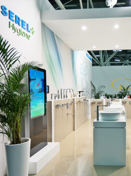
Eca Serel Cersai 2015
Bologna/Italy
For the fair in Bologna, which is one of the fairs attended by ECA Serel every year, a design reflecting the innovative face of the brand was made. A minimal design has been designed to attract visitors into the stand.
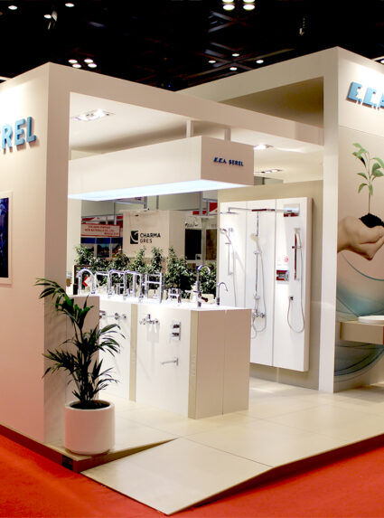
Eca Serel The Big 2015
Dubai/UAE
In this design, products have been displayed on partly extruded semi-wall surfaces and lacquered display units. The stand has been designed with the principal of leading all visitors from all sides of the booth.

Mustafa Erten House
Istanbul/Turkey
We were asked to design a bedroom in an attic of a two stories house, located in İstanbul. Inspired by casual luxury, we aimed to create not just a bedroom but also a living space with a reading corner. Under the tone of gray, we added brass, emerald color to enrich the ambiance.
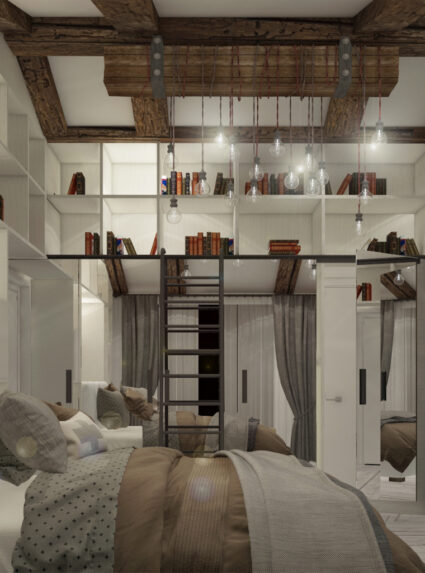
Tekdurmaz House
Istanbul/Turkey
In view of the client’s needs of living, we made the concept design for a 3 membered family house in İstanbul. The house consists 2 main bedrooms, 1 guest room, 1 study room and 1 bathroom. The rooms have the same interest in color expression to create a calm resting place where one can leisurely enjoy time.
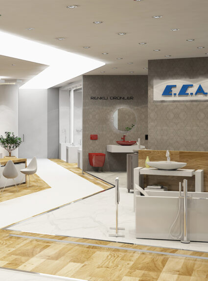
Eca Serel Showroom Cologne
Köln/Germany
Pure white, rhythmic, illuminated corian display units for the products, natural wooden floors, barrisol ceilings and reflections of barrisols on the floors were the main components of the project.
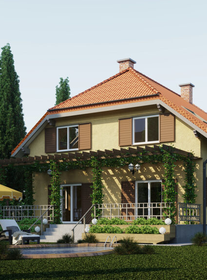
Hydn House
Vienna/Austria
The main purpose was to maintain the traditional Austrian housing style to the design. From the porch, sitting room, living room to dining room, It’s been used the mixture of the wood and stone through out the design.
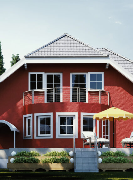
Schubert House
Austria / Vienna
The main purpose was to maintain the traditional Austrian housing style to the design. From the porch , sitting room, living room to dining room , It’s been used the mixture of wood and stone through out the design.
Kaya Palazzo Eca Serel Exhibition
Antalya/Turkey
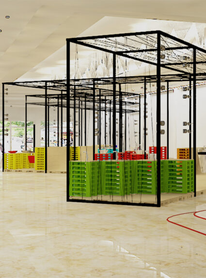
It was an exhibition project which will will be located in a hotel lobby in Antalya. The concept was creating a flow between booths with the help of color chart inspired by the seven colors of rainbow. One of the significant feature of the project was using colorful pallets as display units.
Tekyaz Office Lounge
Istanbul/Turkey
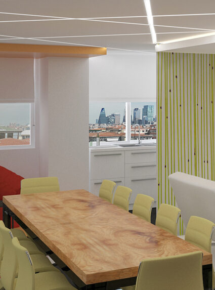
For this customer who wants their staff to spend more quality time, dynamic and linear ceiling lighting in the lounge area of the office, comfortable seats, a large table where collective celebrations can be held, event and playgrounds are designed by us.
Stonefly Showroom Ankara
Ankara/Turkey
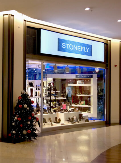
The space is renovated with the custom made displaying units that reflects the Stonefly brand.
Stonefly Showroom Florya
Istanbul/Turkey
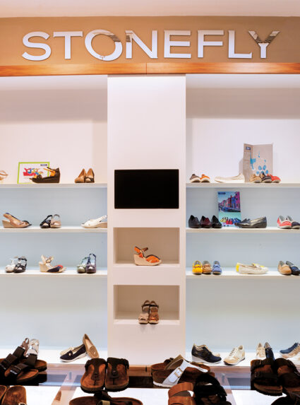
In this small store, we have aimed to reflect the Italian simple yet chic style. We created a spacious layout and used white colors both for walls and displaying units.
Stonefly Showroom Sisli
Istanbul/Turkey
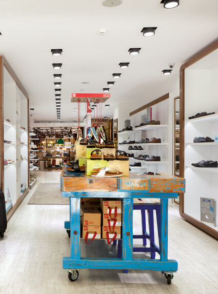
In this store that is designed by gathering the different styles together, we have created individual displaying units for different types of shoes. We also renovated the antique chairs and shoe making counters by painting them specially.
By using them in the same space with the Italian brand moden chairs and sofas, we have referred to the rooted history of the brand yet innovator interface.
Distanbul Showroom
Istanbul/Turkey
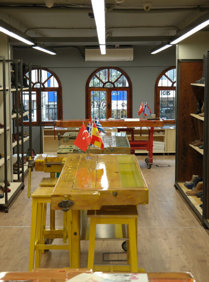
This wholesale store stands out with the specially painted and polished shoe making counters that is used as displaying units and meeting tables. In a space that is as low-ceiled and narrow as it is, we have created a striking atmosphere with the dramatically colorful furnitures.
Versace 1969 Showroom Fatih
Istanbul/Turkey
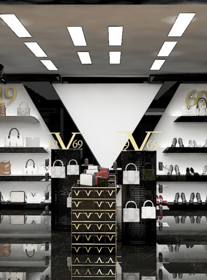
A decent balance with the luxury and simplicity is achieved with the plain white walls and hidden led lighting while making the store more spacious.
Versace 1969 Aymod 2016
Istanbul/Turkey
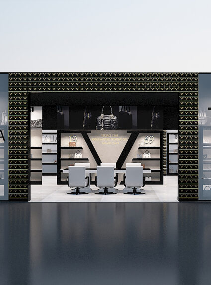
This fair stand concept design was made for Versace 1969 to be located in Aymod 2016 Fair. It was important that the stand reflects brand’s identity as .The transparent material covering the facade of the stand creates an appealing feeling for the customers.

Versace 1969 Showroom
Istanbul/Turkey
The main design object of this store is to reflect the luxury and quality of the brand Versace. With this respect, black marble that recalls the luxury is selected, as well with the leather Chesterfield sofa and brass railing. A decent balance with the luxury and simplicity is achieved with the plain white walls and hidden led lighting while making the store more spacious.
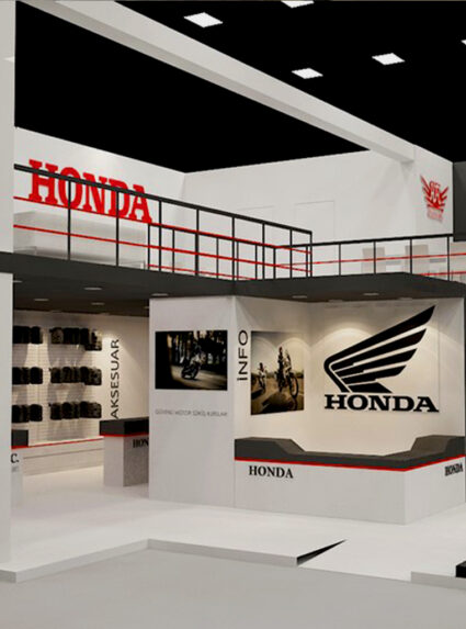
Honda Motoshow 2016
Istanbul/Turkey
In accordance with the brand’s wishes, the 2-storey sales and meeting areas are spatially separated, and an exhibition area has been designed to display launch products that can be created with a low budget.
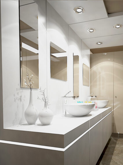
Eftalya Balık Fish Restaurant
Istanbul/Turkey
In this space which is one of the famous fish restaurant in İstanbul, we have renovated the wet areas and the foyer. By using large mirrors on the walls, we have created a more spacious feeling.

Zerafet Restaurant
Istanbul/Turkey
In this steak-house, our design aspect was to make the space to be felt elegant and luxurious beginning from the entrance. The materials were the natural stones and various elements in grey-anthracite colors.
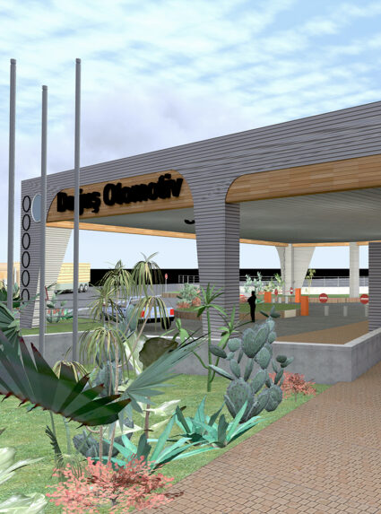
Doğus Automotive
Istanbul/Turkey
This was a renovation project for Doğuş Automotive, and the main entrance is designed to show all the sub-brands and the power of the company as well. Metal and wooden surfaces are used together in this project.
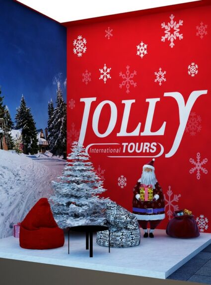
Jolly Tur Emitt 2016
Istanbul/Turkey
In this project, inspired by the street of a touristic city, a bus was designed to welcome visitors in the middle area. In addition, this bus includes meeting room and service functions. Summer and winter corners have been created to reflect the brand’s holiday spirit.
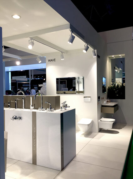
Eca Serel The Big5 2016
Dubai/ United Arab Emirates
In this design, varied products have been displayed on independent wall surfaces and lacquered display units. Cafe area has been separated from the hall and exhibition space with planted modular pots.
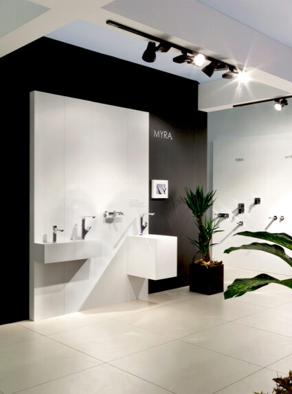
Eca Serel Unicera 2016
Istanbul/Turkey
750m2 total stand area has been achieved by 1m x 1m dimensioned white flooring, raised floors and wooden lacquered furnitures. The stand has been designed with the principal of leading all visitors coming from the main entrance directly to the display units and than 300m2 cafe area. This stand reflects the innovator aspects and products of ECA Serel, has been designed with pure white walls, very light-weight and permable roof nets and lacquered panels as displayers for the faucets and accessories.
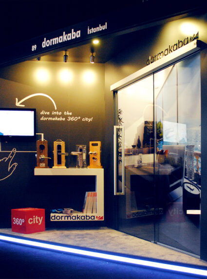
Dormakaba Architect @Work 2016
Istanbul/Turkey
For one of the sector’s biggest fair, Architect @work. We are asked to design a functional stand which is consisted of 9m² for Dormakaba who provides access control and security solutions on the global market.
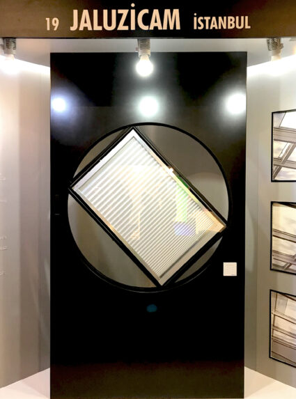
Jaluzicam Architect @Work 2017
Istanbul/Turkey
For one of the sector’s biggest fair, Architect @Work2017. We are asked to design a functional stand which is consisted of 10m² for Jaluzicam who provides blind systems on the global market.
Honda Motoshow 2017
Istanbul/Turkey
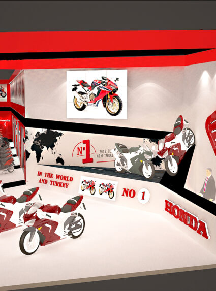
In this project, a design that emphasizes the development of Honda’s design concept over the years was preferred. The motorcycle road that starts on the information desk and continues on the stand units and wall surfaces has been the focal point of the design. It is aimed to exhibit motorcycles on this unusual road.
Carglass Vip Lounge
Istanbul/Turkey
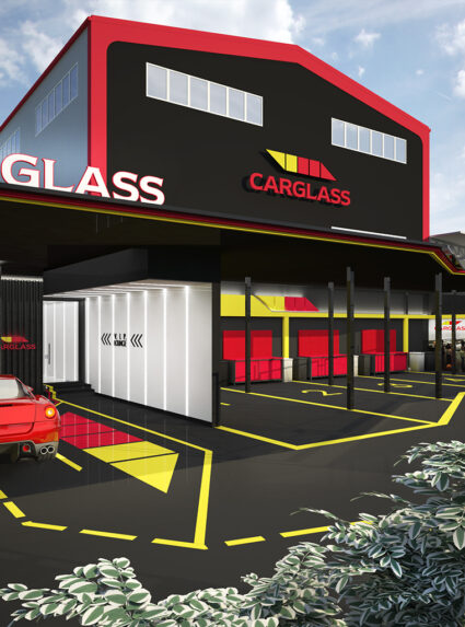
Carglass is one of the world’s leading vehicle glass repair and replacement service providers. It was important that the design represent brand’s identity. The materials and colors used creates continuity through the whole space. The usage of red and yellow lines creates a strong flow.
Eca Serel Sodex 2018
Istanbul/Turkey
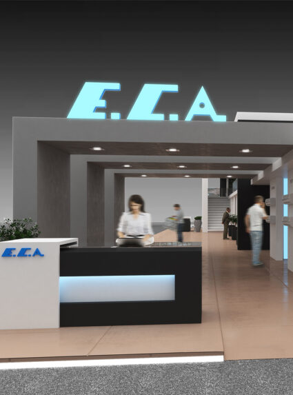
This two-storied stand reflects the climatization products of ECA, has been designed with spring and autumn concept. The project has one main corridor; one side is for displaying spring&summer time products and the other side is for displaying autumn&winter products. Whereas the second floor is designed as a catering area.
Kronfuss House
Vienna/Austria
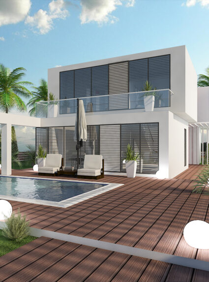
For this family of four, who live in Wien, we created a modern home with wide open windows and garden access. With the huge gallery space, high windows and minimum partition walls; we achieved an uninterrupted view.
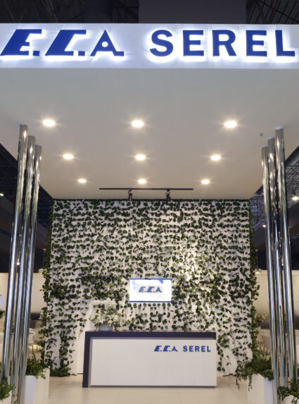
Eca Serel Unicera 2017
Istanbul/Turkey
The stand design has been achieved by spacious white flooring, raised floors and wooden lacquered furnitures. The focus point of the project was the acquarium area which also has a function to display new products. This project, which is composed of 750 m2 total area seperated as 450m2 showroom and 300m2 cafe, has been designed with the principal of leading all visitors coming from the main entrance directly to the stand.
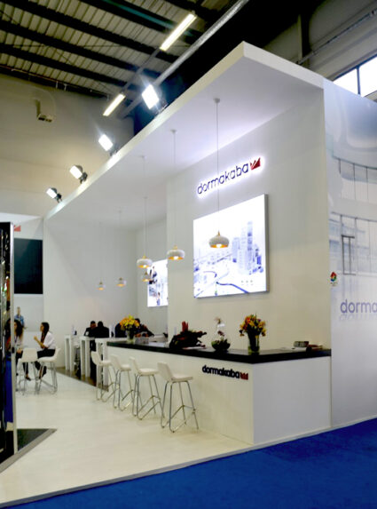
Dormakaba Turkey Build 2017
Istanbul / Turkey
In this design of 200m2 exhibition stand, divided corridors have been created in order to provide various areas for the mounted door products. Additionally, attractive focal points for the visitors are created by decoratively lighten products.

Emas Sodex 2018
Istanbul/Turkey
This fair stand concept design was made for sanitaryware brand for Eca Serel to be located in Ish 2019 . We created repetative boxes which can be used as display stands for the brand’s valves product. White color is chosed as main color to create a neutral background for the products.
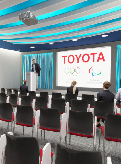
Toyota Head Office
Istanbul/Turkey
İstanbul. The main purpose was to design stage area by using neutral tones on the wall and on the floor while we create a balance by creating wavy effect on the ceiling.
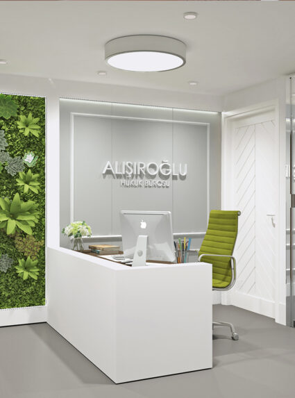
Alisiroglu Law Firm
Istanbul/Turkey
We were asked to renovate a law firm interior in order to respond client’s needs . The materials and the colors used create an elegant and calm environment out of the ordinary feeling of general understanding of a law firm .
Bk House
Istanbul/Turkey
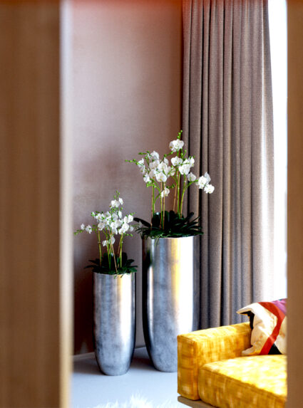
The interior design is simple and lively, in which the materials and the furnitures are warm and graceful. The open kitchen makes the space clear and bright. In the dining hall, sitting room and the hallway, much use of woods links the spaces together.
Eca Serel Dost Boya Showroom
Ankara/Turkey
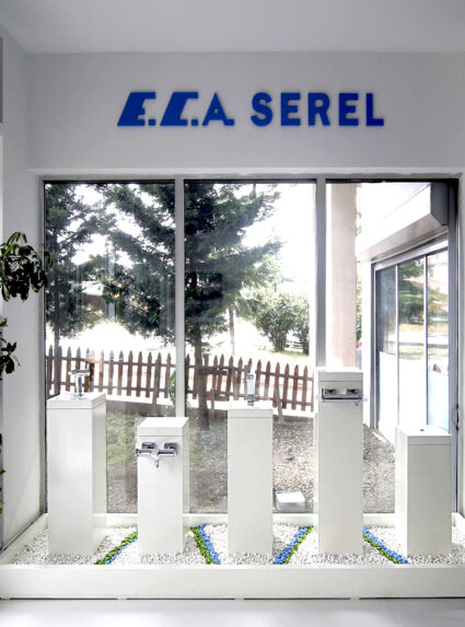
This showroom reflects the innovator aspects and products of ECA Serel, has been designed with the new concept including wavy panels colored with inspring hues of nature. These panels also function as displayers for the faucets and accessories. The showroom has been located in the attracted area of Ankara. The flooring used in the showroom is concrete gray epoxy basedwhich helps the colored units to pop up, and wooden lacquered furnitures.
My Coach Vip Fitness & Pilates
Istanbul/Turkey
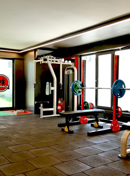
Predominately red color is used in this private fitness center in order to reflect the energetic spirit of the space. For this purpose; floor ceramics of the wet area, wall paints and furnitures are selected in red color. Whereas the rest of the walls are painted in black to compliment the red color.

Merve Colak Dereli House
Istanbul/Turkey
Inspired by our customer’s colorful personality, we aimed to design her apartment as spatial, modern and energetic. On entering the living room throughout kitchen, we are encountered a peaceful combination; a strong flavor of vibrant yellow and natural tones.
Acr House
Istanbul/Turkey
The main purpose of children room design was to use natural wood material in the room, and to create a functional Montessori style room for the children in such a small area.
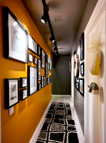
The corridor of the house is also designed as an art and photo gallery with rhytmic and different sized frames. Track lightings and wall colours are chosen to make a focus on the frames.
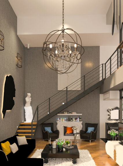
Elif Çolak House
Istanbul/Turkey
In this project that we blend the exposed concrete with classical furniture and accessories, the simplicity is balanced with the luxury.
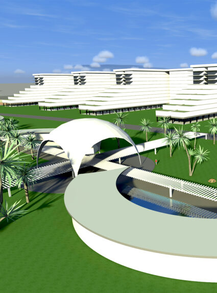
Riyadh Residences
Riyadh / Saudi Arabia
In a living complex designed for worker groups working in Saudi Arabia, recreation areas and housing types of various scales are a project made by considering the geography and climate structure of the region.
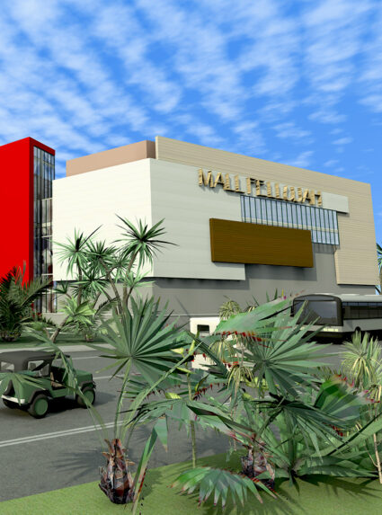
Mall Fellujah
Iraq
As to be one of the shopping mall in Erbil, we proposed the architectural project . The aim was to create a contrast and vibrant facade to get the attraction .
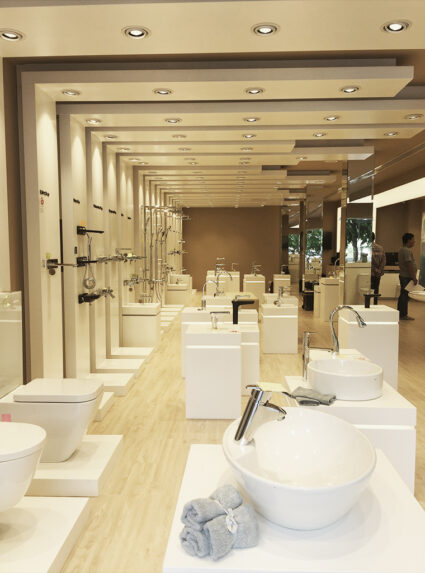
Eca Serel Showroom Cambodia
Phnom Penh/Cambodia
As an answer to our question of how it is possible to display a wide range of product without overwhelming anyone, we have found the solution in creating a rhythm using repetitive displaying units.
Eca Serel Ish 2015
Frankfurt/Germany
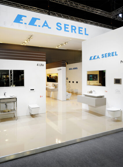
In order to use the maximum height of the area, ceiling suspended truss system has been established while the impressive light beams provide the products shine through. Different zones for the catering area and meeting rooms have been emphasized by easily accessible raised flooring.
Eca Ish 2015
Frankfurt/Germany
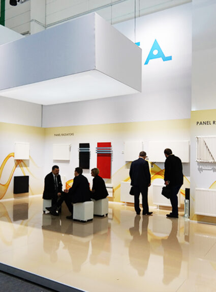
In this two-story stand; upper floor is designed as a cafe, whereas the ground floor is dedicated to the exhibited products. The 8-meter-height wall is covered with the visiuals emphasizing the power of the brand; and the brand slogans are displayed on the 20-meter-length illuminated advertisement area.
Eca Serel Ideobain 2017
Paris/France
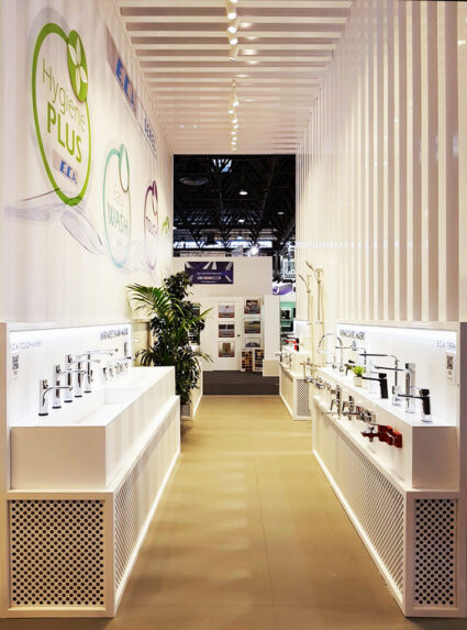
This four side accessible stand has been designed with the idea of leading all exhibition visitors through the stand. In order to make the stand clearly visible, rhythmical bearers have been used for the great effect of transparency; whereas exclusive spaces have been created by the customized exhibition units.
Eca Serel The Big 2017
Dubai World Trade Center
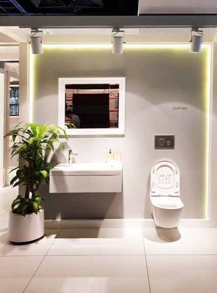
In this design, aried bathroom sittings and products have been displayed on independent wall surfaces. Cafe area has been separated from the hall and exhibition space with the decorative ropes and modular furnutires.
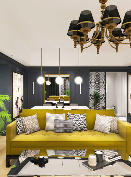
Drn House
Istanbul / Turkey
In this project, we started off with the avangard but not eye-straining design aspect and especially by paying attention to the color harmony. All choices of floor coverings, wall paintings, textile products and furnitures embraced that design concern and as a consequence an elegant harmony have been achieved successfully with client’s satisfaction.
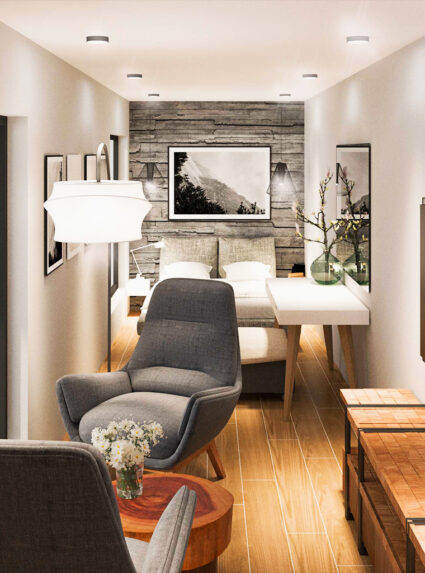
Container Hotel VikI Myrdal
Iceland / Vik i Myrdal
We were asked to design modern hotel project by using containers in an Iceland village which gives opportuty to live the famous northern lights experience and the nature of Iceland. The containers are designed and planned to produced in Turkey, by Zoon Architecture. The units are planned to finish with all details in Turkey and then transport to Iceland via shipping.
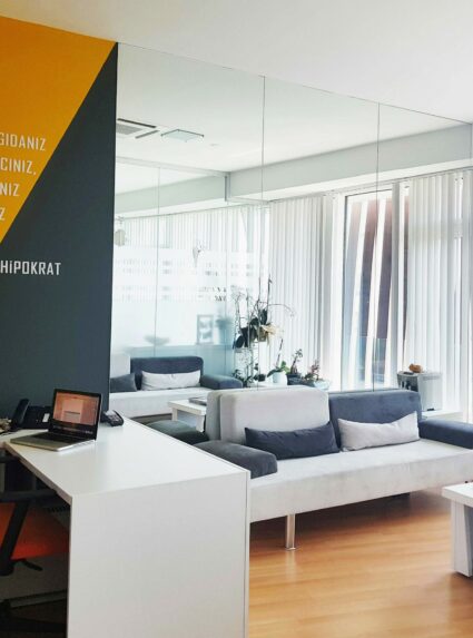
Sheydi Diet Consultation Office
Istanbul / Turkey
We have covered the restroom walls with light coloured wallpaper, which was looking quite gloomy before. We also covered the whole built-in wardrobe with mirror, placed crosswised recessed lineer led lighting and achieved a much more eased and dynamic space.
In order to create an energetic space, we painted the walls with diagonal dramatic colors. Due to the mirrors covered from floor to the ceiling, we made the lounge area and visiting room seem larger than they are while increasing the lighting level.
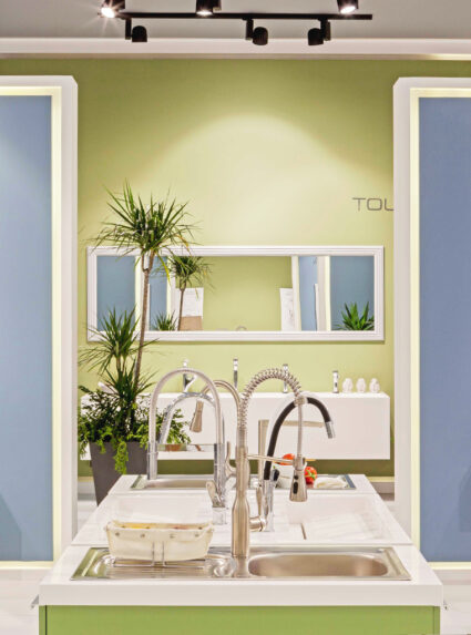
Eca Serel Unicera 2018
Istanbul / Turkey
This project, which is composed of 750 m2 total area seperated as 450 m2 showroom and 300m2 cafe, has been designed with the principal of leading all visitors coming from the main entrance directly to the stand. The stand design has been achieved by spacious white flooring, raised floors and wooden lacquered furnitures. The color scheme has beed derived from nature. The drawings on the facade which are exclusively designed for the brand.
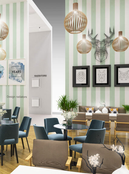
Eca Ish 2019
Frankfurt / Germany
This stand reflects the climatization products of ECA, has been designed with spring and autumn concept. The project has 2 main corridors. First one is for displaying Spring & Summer time products and the second one is for displaying Autumn & Winter products. With wallpaper covered walls and comfortable furnitures, customers can feel their self like at home at the coffee-bar area.
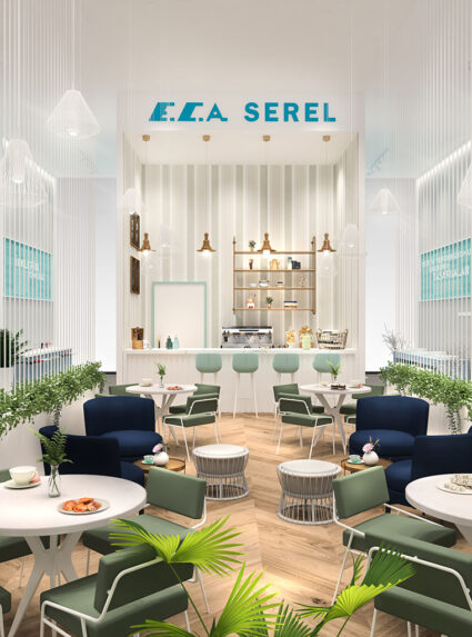
Eca Serel Ish 2019
Frankfurt / Germany
In order to use the maximum height of the area, special designed product launching area has been established with glowing impressive materials. Catering area is also special designed with luxury coffee-bar consept. Different Bathroom concepts have been emphasized by different coloured raised flooring.
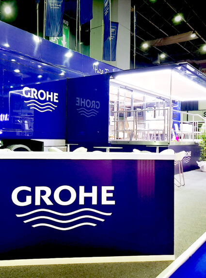
Grohe Unicera 2019
Istanbul / Turkey
Grohe is the world’s leading provider of sanitary fittings and a global brand, dedicated to providing innovative water products. We were responsible from the construction phase which was finished precisely with customer’s pleasure.
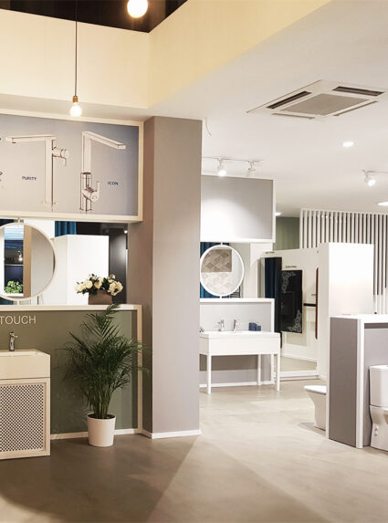
Eca Serel Novaplast Showroom
Adana / Turkey
As in the other showrooms of the bathroom sanitary wares company, ECA Serel , we aimed to create dynamic display areas in order to highlight the products. We followed the concept of blue and green pastel tones to maintain spacious environment.
Eca Serel Unicera 2019
İstanbul / Turkey
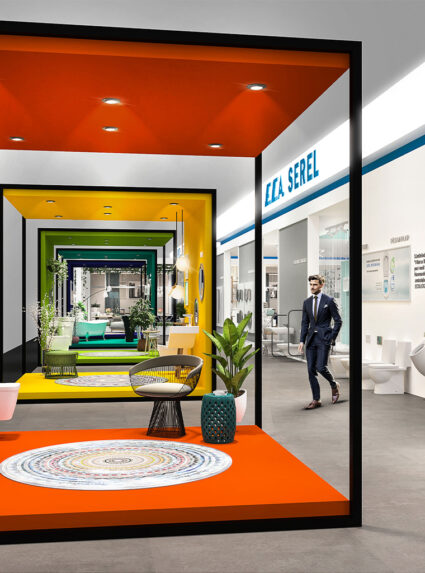
This exhibiton stand proposal was made for Eca Serel, one of the leader sanitaryware company in Turkey, to be located in Unicera 2019 Exhibition, the world’s second largest in its field. We aimed to create an appealing design to attract visitors around the space.To achieve that welcoming and appealing feeling in the stand we decided to use five colorful booths where the products can be displayed. Since these booths have only one solid surface we also achieve the transparency through the stand. In the middle of the stand there is an other attraction unit on which you can see the seasonal launching products of Eca Serel. This blue iconic box and lineer drop lights also represent water effect. The cafe which also functions an open meeting space has a welcoming ambiance.
Eca Serel Akis Yapi Showroom
Istanbul / Turkey
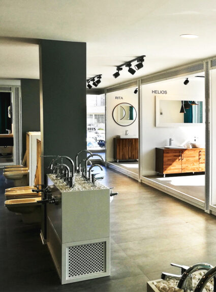
This showroom reflects the innovator aspects and products of ECA Serel, has been designed with the new concept including wavy panels colored with inspring hues of nature. These panels also functions as displayers for the faucets and accessories.
The showroom has been located in the attracted area of Istanbul. The flooring used in the showroom is concrete gray epoxy based which helps the colored units to pop up, and wooden lacquered furnitures.
Omsk Carbon Turkey Office
İstanbul / Turkey
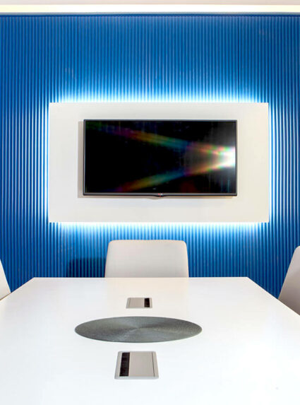
Omsk Carbon is one of the leading manufacturers of carbon black in the world. Omsk Carbon institutionalization of the brand design we do for the Turkey office has brought to the forefront. In addition, the design has been given a simple look by using decorative illuminated panels and white furniture in the main color of the brand.
Eca Serel Aksimum Store
Turkey / İstanbul
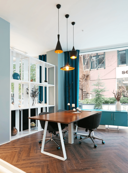
This showroom reflects the innovator aspects and products of ECA Serel, has been designed with the Zoon’s new concept including the solar powered lights and customized exhibition units. Modern looking spaces has been achieved by Pandomo flooring, raised floors and metal units which are exclusively designed for the brand.

